Rehoboth Centrum
Rehoboth Centrum is a multi-purpose lifestyle and community space that brings together different experiences under one brand — including events, café services, and beauty care.
Tool
Figma
Year
2026
Role
UX/UI Designer

Problem
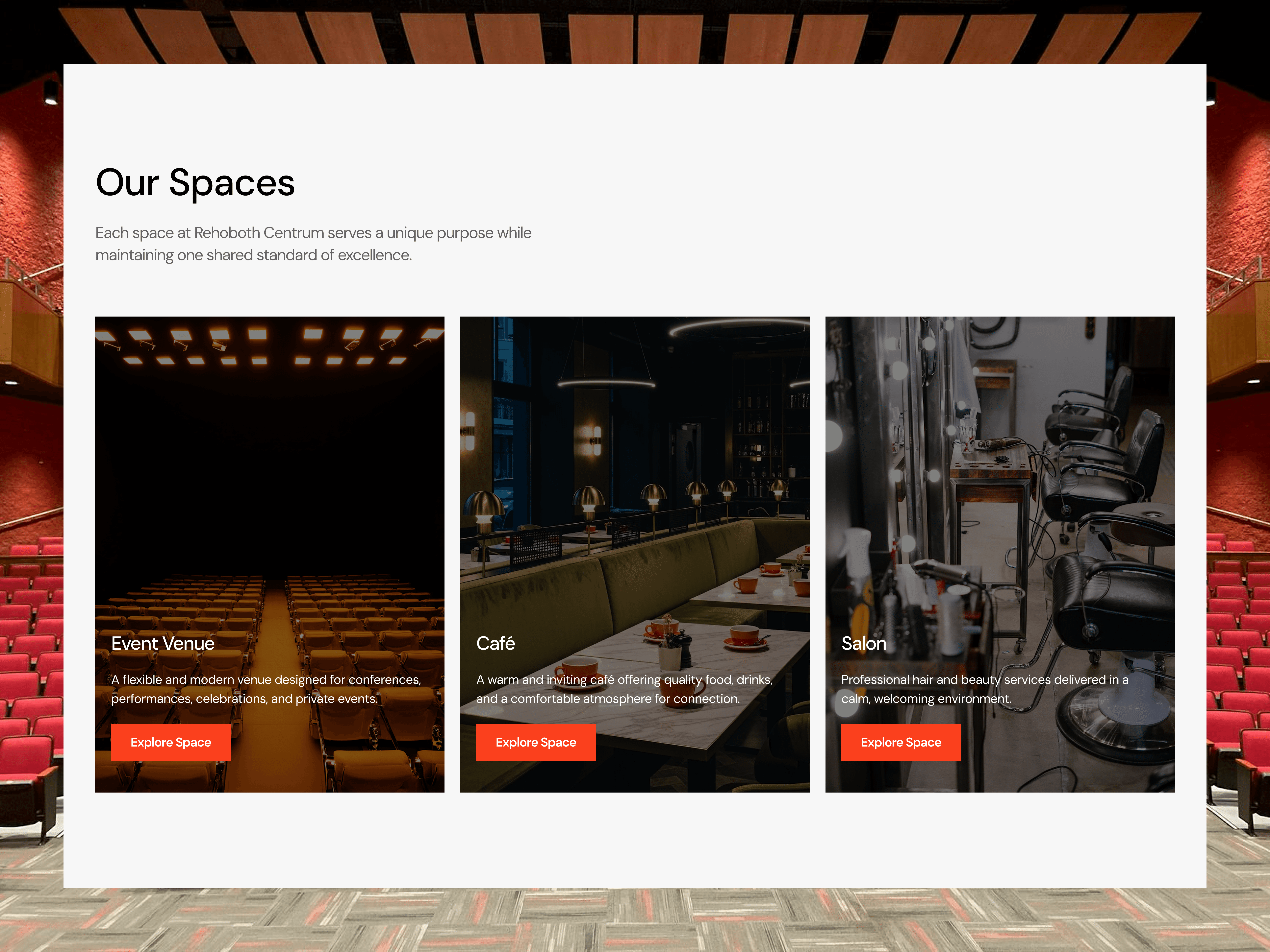
Rehoboth Centrum offers multiple services within a single ecosystem:
• Event venue
• Café
• Salon
The challenge was presenting these services clearly without overwhelming users.
The brand also lacked a refined visual identity that could unify the different experiences and translate effectively into a digital product.
Additionally, users needed an easy way to:
• Discover events
• Explore services
• View the venue atmosphere
• Make reservations or bookings.
Competitor Analysis
To understand how similar businesses present their offerings online, I analyzed several hospitality and multi-service platforms.
Key insights included:
Clear Service Segmentation
Successful platforms clearly separate different services into dedicated sections or pages.
Visual Storytelling
High-quality imagery and gallery sections help communicate the physical experience of the space.
Simple Booking Interactions
Reservation or booking processes must be straightforward and accessible from multiple sections of the website.
These insights helped shape the structure and layout of the final website.
Moodboard
The visual direction focused on creating a balance between elegance, warmth, and modern digital clarity.
Key inspiration themes included:
• Modern hospitality brands
• Lifestyle and community spaces
• Minimal and elegant UI layouts
• Warm, welcoming visual tones
The goal was to design an experience that feels both premium and inviting, reflecting the physical environment of Rehoboth Centrum.
Design Iteration
Several design explorations were created during the early stages of the project.
These included:
• Multiple logo concepts and brand directions
• Layout variations for the homepage hero section
• Different visual treatments for service cards and sections
• Iterations on navigation structure
Feedback from stakeholders helped refine the direction until the final brand and interface system was established.
Design Kit & Delivery
Color Palette:
The color palette was designed to communicate warmth, sophistication, and clarity.
Primary colors establish the brand identity, while supporting neutral tones ensure readability and visual balance across the interface.
The palette was also designed to maintain strong contrast for accessibility while keeping the overall aesthetic clean and elegant.
Typography:
The typography system focuses on clarity and hierarchy.
A modern sans-serif typeface was used for headings and interface elements to ensure readability across different screen sizes.
The typographic hierarchy includes:
• Display headings for key sections
• Section titles for page structure
• Body text optimized for readability
• Supporting text for metadata and descriptions
This system ensures consistency across all pages and components.
UI Components:
To maintain consistency and scalability across the website, a reusable component system was created.
Key components include:
• Navigation bar
• Hero sections
• Service cards
• Event cards
• Gallery layouts
• Booking form elements
• Call-to-action buttons
• Footer structureThese components allowed the interface to remain visually consistent while accommodating different types of content.
Outcome
The final result is a modern website that clearly communicates the brand’s identity and organizes its services into a seamless digital experience.
The website successfully translates the physical experience of Rehoboth Centrum into a digital platform that helps users discover the space, explore services, and engage with the brand.
Final Delivery
The final deliverables included:
• Refined brand identity and logo direction
• Complete website UX structure
• High-fidelity UI designs in Figma
• Reusable design components and layout system
• Responsive page designs for all sections
The website has now been successfully launched and is live.